Going into the end of the year – we start to see retail sales climb with all the upcoming holidays. Perhaps you’re simply duplicating your company’s same signage year after year – just changing out the sales dates and the current year. Or you’ve at least been adding your new sales pitch or messaging to the signs, but the colors, typeface, and sign dimensions have remained the same year over year.
When you do begin considering what you might want to do differently with your signage, there are a variety of ways to have your sign and message truly stand out. Take a look at the following list of 5 ways to “wow” your current and prospective customers, and see which could be integrated into your new signage:
Add vibrant color(s) to your design:
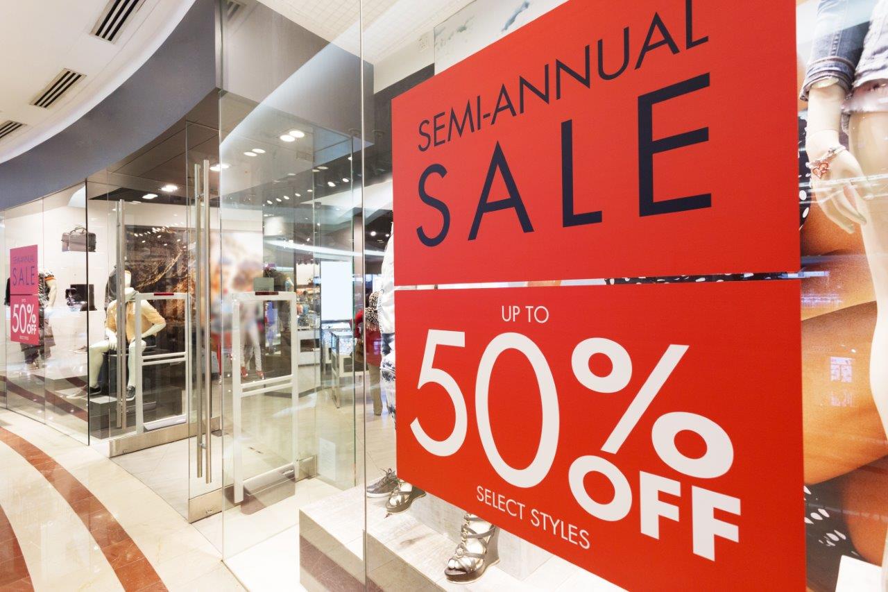
Don’t hesitate to utilize bright, vibrant colors in your sign’s design (beyond your brand’s standard colors) – bright colors tend to draw the eye more immediately than do bland colors. Of course, the usual rules of color still apply here: Avoid colors that might visually fight with the standard color(s) of your brand or logo; and don’t use too many colors in any single sign – after all, you’re designing a sign, not a ransom note.
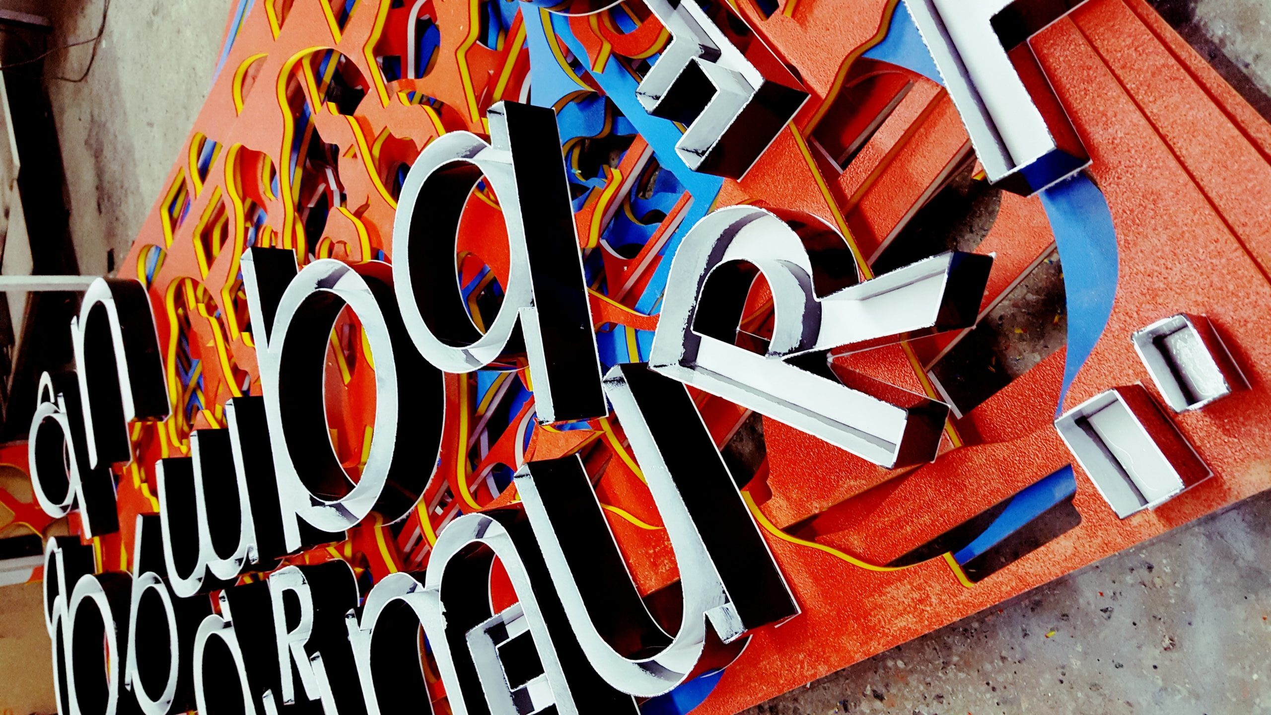
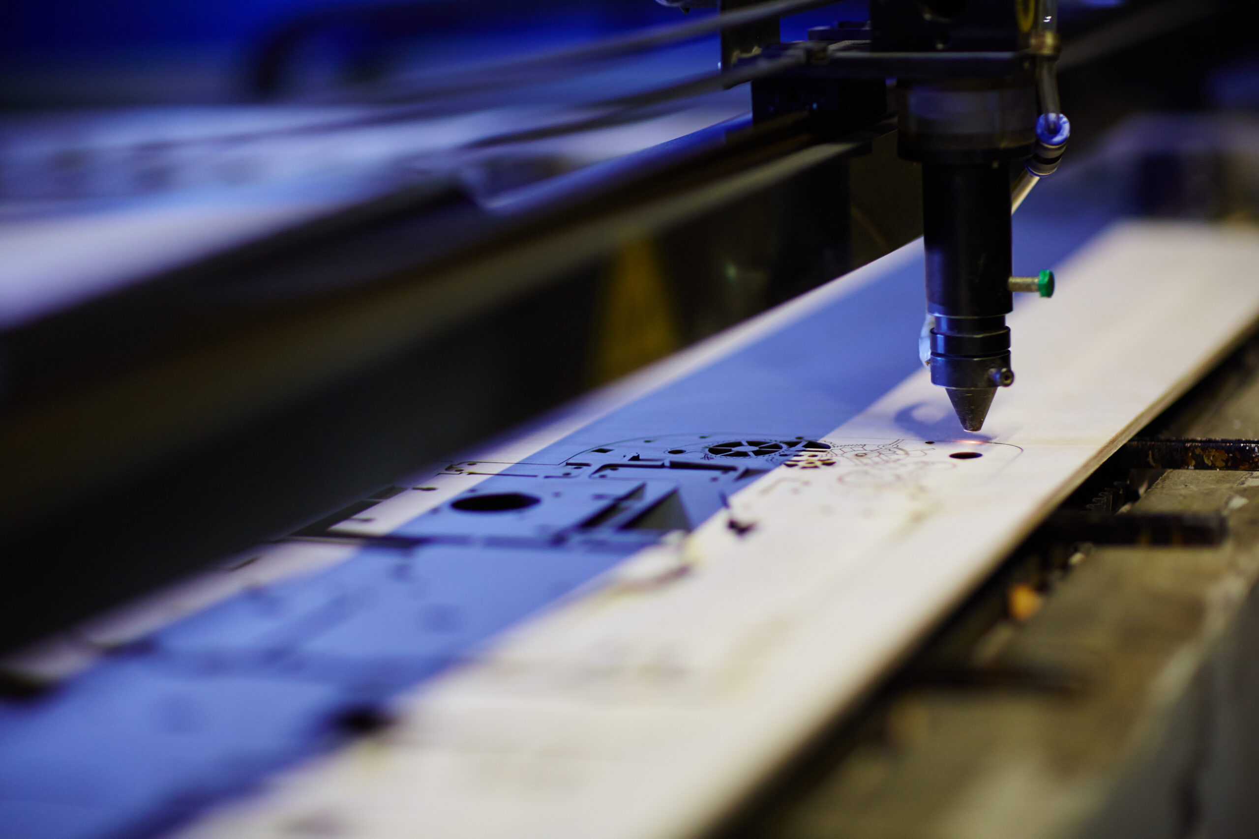
Integrate custom shapes:
There’s nothing at all wrong with standard squares or rectangles – hey, we’re big fans! But consider how a different shape – say, a triangle, an oval, or other custom shape – will truly help your sign stand out. And let’s face it, differences often get attention. Naturally, you want to make sure that your message will fit within your preferred custom shape without minimizing the size of your typeface or any image you’re using. Nor do you want a custom shape to overly distract from the message itself. Many of the rigid signage you’ll find here at Signarama Louisville East can be customized to almost any shape you can come up with: aluminum, plastic, acrylic, foam board, and other materials.
The floor offers more:
Many consumers have become more aware of floor graphics because of COVID and the necessary social-distancing messaging that retailers and restaurants have put in place. But floor graphics can be utilized for so much more – from in-store sales and promotions to directional signage and event graphics!
Reverse your type, use unique typefaces:
Can you drive more attention to your signage by changing up your tried-and-true typeface? Or maybe you’ll benefit from using reverse type – a white or light-colored type on a dark background (sometimes called “knockout text”)? You might want to experiment with this for a special sales promotion or another small series of signage. Just don’t forget the number-one rule when it comes to typefaces and fonts: Your message must remain readable! In a poll sponsored by the Signage Foundation, consumers indicated several major factors that typically made a sign hard to read, including: letters were too small (83%); letters used a “fancy” font (48%); and letters were spaced too tightly together (36%).
Go bigger:
Admittedly, there’s no definitive size-to-attention formula, but it stands to reason that size is another critical factor when it comes to increasing the number of eyeballs to your sign. Increasing the dimensions, just slightly, of your signage, you can garner quite a bit more message space. For instance, if choose to move up from a 24” x 12” sign to a sign measuring 36” x 18,” you’re more than doubling your available message space (648 square inches vs. 288 square inches total) – that’s a lot of additional room for your graphic or a larger typeface.